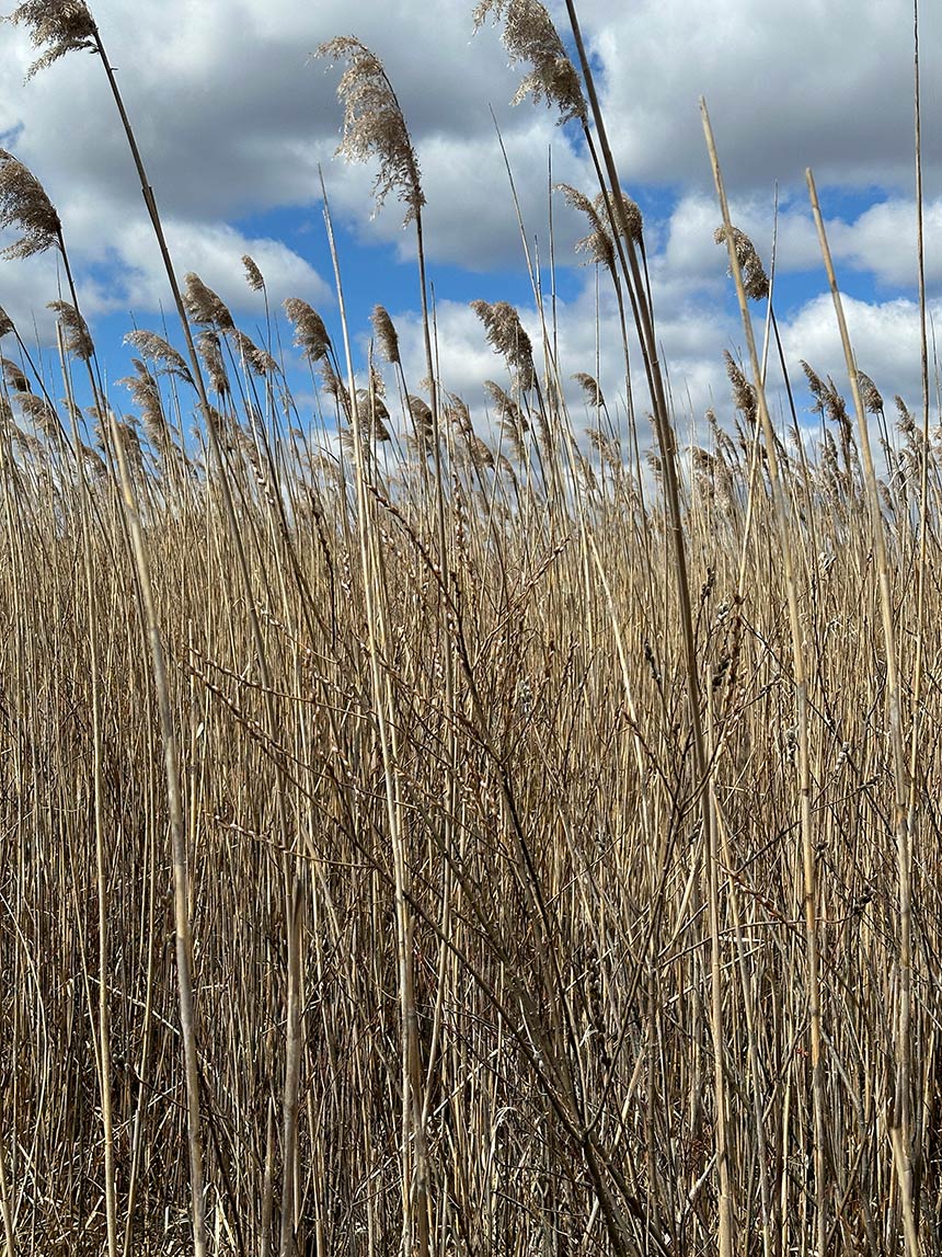
Early this spring I came upon these marsh grasses and loved how they danced in…

I began using maps in my artwork several years ago when I was trying to solve the dilemma of painting a toucan’s large beak and keeping it interesting. I decided to collage an antique map of the toucan’s homeland underneath the bird, and I was thrilled to find a picture of a small section of a South American map drawn in the 1600’s. It was intricately drawn and beautifully embellished, and adding it enhanced the image and helped to ground the subject within its story of origin.
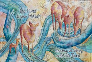
Last year, while thinking about how to paint my image for the collaborative book River, I came up with several ideas for creating a textural under-painting for the design. Each idea I experimented with overpowered my image and finally I thought of using a map of our local Haw River. I found a map of the river basin and surrounding areas of Virginia, North Carolina, and South Carolina drawn in 1781. Using the map as an under-painting worked beautifully to subtly tell the Haw’s story without overpowering the design.
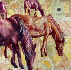
Over the past couple of years, I have used nautical maps (called charts in maritime language) as part of under-paintings for a body of work featuring Cape Lookout and Shackleford Bank, North Carolina. I love all the circles and grids contained in a nautical chart. I am especially drawn to the symbol used by the chart’s author, NOAA (the National Oceanic and Atmospheric Administration), which reminds me of a seagull silhouetted by the setting sun. I’ve used this symbol so often that my friends tell me I don’t need to sign my paintings anymore. They see the NOAA symbol and know it’s my work.
For someone who has bragged about not needing to use a map to find my way around, I seem to rely on them all the time now in my paintings. They are a source of beauty and inspiration to me. Whenever I ask myself how I can make an image more interesting, I find that collaging with a map makes the image work wonderfully. Here’s some background about my relationship to maps, and why they might have become important to me: I’ve always had a keen sense of direction.
Before the days of GPS, I bragged that I could always find my way to any destination through instinct alone. Consulting a map was a downright defeat. I was worse than my husband when it came to not knowing where I was going. I’d just keep driving around until the way “felt right”. My sense of direction was honed at an early age and usually involved the influence of my father. His idea of a vacation was driving 500 miles a day cross-country and camping for two weeks with two sullen teens in the backseat (my brother and I). On those trips, maps became a source of entertainment for me and provided an alternative to jumping out of the car window from sheer boredom. At least the trip could be broken down into small, endless, one-inch increments with the highlight of intermittent rest areas to break the monotony. See Nancy’s new watermedia paintings featuring Shackleford Bank wild horses and Cape Lookout Lighthouse on display at Carolina Brewery Pittsboro, June 6 thru August 2nd. To see more of Nancy’s Work, visit her website.
Comments (1)
Leave a Reply
You must be logged in to post a comment.

Hi Nancy,
I love your blog post about maps in your work and the road trips you took as a teen with your Dad- that brought back lots of memories for me too. It’s a great story and I love how it has enhanced your work and become part of your art’s story!